Tom's X11 Fonts
The following fonts are available for free, to use as you please. The
minimal license is included in the header of each font.
Most of the fonts were created or improved with my Tcl/Tk program,
bdfedit. Even though all of the fonts below are
fixed width fonts, the program will also create proportional fonts.
If you've never installed an X11 font, please
read the installation instructions.
Atari-Small
This is named atari small because it was designed for a terminal emulator
I wrote for my Atari 800. It only had a 320 pixel wide display, but I wanted
an 80 column terminal, hence we have a 4x8 font. This is somewhat cleaned up
from the original version. It has only a 1 pixel descent to maximize pixels
available to the main body of each character.
 Download
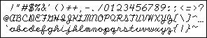
Dagger
Designed for an angular, medieval, vampire sort of look. It grew out of the
font (also developed by me, but not an X11 font) used for my animated name
on my Fun and Games page. This font is
9x14 with a spacious 4 pixel descent.

Updated, August 2007 - complete set of
characters
 Download
Radon
An electronic, yet friendly font. I like this one quite a bit. 8x12
with a 2 pixel descent.
 Download
Radon Wide
The same font as above, with an extra pixel of width to make the spacing
even more friendly. 9x12.
 Download
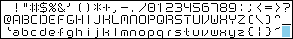
Cursive
This was inspired by Scott Adams' Adventures (the Atari version and others
used a really hideous cursive font).
The attachments are ok, but not great. 9x15, with a 4 pixel descent.
I used to say here, that I thought it would be neat to do this proportionally,
which would help the attachments, and also to use the 8-bit characters for high attachments, and the 7-bit set for low attachments. That font is not
this font; that font is the font after this font.
 Download
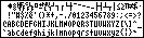
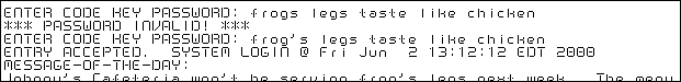
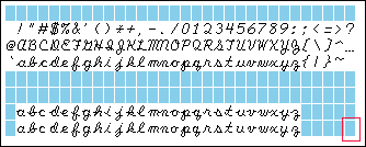
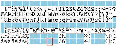
Smart Cursive
I wrote a long time ago, the part above, about how it would be neat to
do better attachments. Well, this is it! It's proportional, not
fixed.
The "normal" set of letters has leadins that attach all the way at
the bottom (instead
of the compromise of the previous font). There's an alternate set of
lower-case letters with high lead-in attachments, with ascii values
96 above the normal lower-case letters (where you would normally find
the meta-shifted characters). There's another alternate set
of lower-case letters with no lead-in attachments, in the ascii + 128
positions (where the lower-case meta characters would normally be).
This is still not perfect, but a nice improvement. Of course, you
need to write some special program to properly connect the letters.
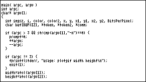
Something like this perl example:
sub make_cursive_ppm {
  ($input,$outfile)=@_;
  for ($i=length($input)-1; $i>0; --$i) {
    if (substr($input,$i-1,2) =~ /[bovw][a-z]/) {
      substr($input,$i,1) = sprintf("%c",ord(substr($input,$i,1))+96);
    } elsif (substr($input,$i-1,2) =~ /[^A-Za-z][a-z]/) {
      substr($input,$i,1) = sprintf("%c",ord(substr($input,$i,1))+128);
    }
  }
  if (substr($input,0,1) =~ /[a-z]/) {
    substr($input,0,1) = sprintf("%c",ord(substr($input,0,1))+128);
  }
  system("pbmtext -font cursive-smart-9x15.bdf $input > $outfile");
}
The following sample shows some of the different versions of the letters.
In particluar, each word in the second line starts with a letter that
is shown in that word in all three forms; e.g. "avalanche" has the
letter "a" shown with three different lead-ins:

 Download
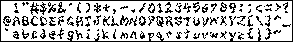
Inkblot
This won't win any awards for readability, but it certainly is stylish.
9x13 with 3 pixel descent.

 Download
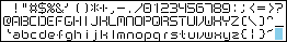
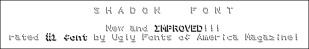
Shadow
I've always liked this style of characters. It was tough cramming it into
a font, even at 12x18, and I'm still not satisfied. It has a 4 pixel descent.
This is more of a banner font.
 Download
Shadow-Bold
The bold form of the above font; same dimensions.
 Download


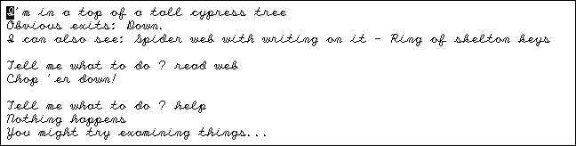
 Big Nethack Font


In addition, I have a font for use with nethack,
described on another web page.