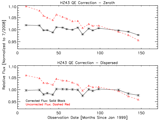
During the recent/ongoing recalibration of the LETG/HRC-S Effective Area,
Nick and Jeremy found a faster-than-trend decrease in the EA at some
(especially the longest) wavelengths covered by HZ43 spectra.
Brad noted that the affected wavelengths correspond to regions
of the HRC-S where detector gain is lowest and suggested that as
gain continues to decrease, a significant and increasing fraction of
events are now falling below threshold and being lost. Further investigation
confirmed this idea and showed that a substantial range of
the LETG/HRC-S is experiencing detectable excess QE loss and that the
rate of loss is increasing. The critical point seems to be when
the mean PHA falls below ~40. All figures below are from Nick
unless otherwise noted.
|
|
|
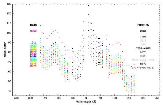
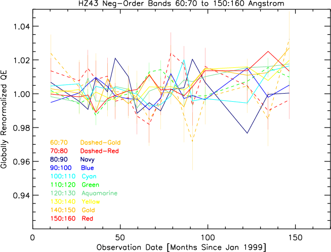
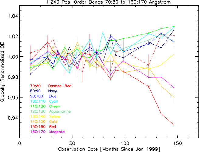
The plots below are similar to Fig. 1, but have been broken into separate curves for different wavelength bands. The curves have been "globally renormalized" by dividing by the red curve in the bottom panel of Fig. 1 to remove the all-wavelength deviations from linear decline (especially for points 3-5 and 11), and then dividing each wavelength's points by the statistically weighted average of the 2nd through 10th points (which are assumed to be free of excess QE losses) so that things will average to 1 in the absence of excess QE losses. The first observation (ObsID59) is excluded from that average because of relatively rapid gain change at early times. The net result of this renormalization is to better reveal deviations of QE within specific wavelength ranges from the broad-band QE changes.
Note that the excess QE decrease at some wavelengths makes the global renormalization factor too large for wavelength ranges that are not experiencing excess QE loss; the curves for the latter wavelengths therefore trend toward values higher than 1 as time goes on. The net excess QE loss seen for λ=150-160 Å is therefore 1.02-0.93 or ~9% in the latest (March 2011) observation.
| 
|
| 
|
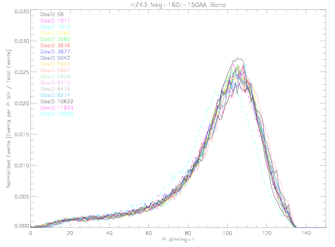
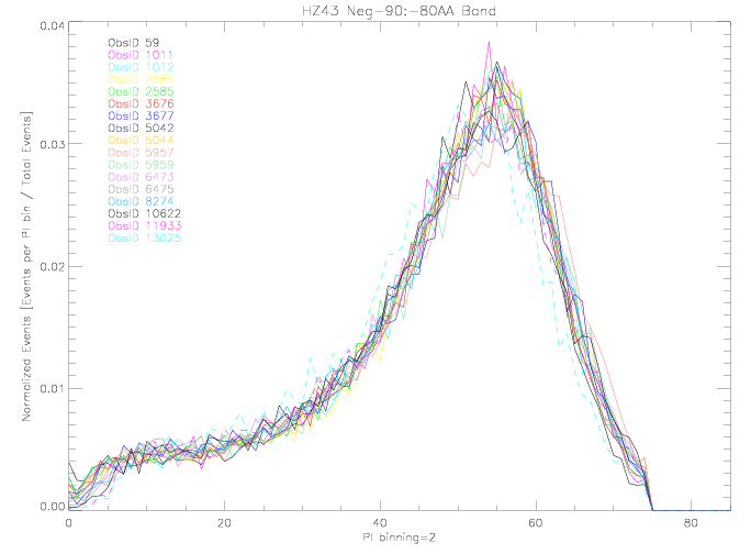
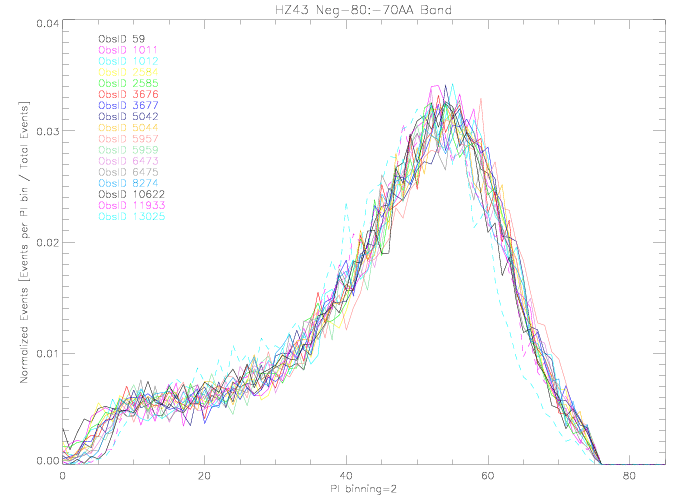
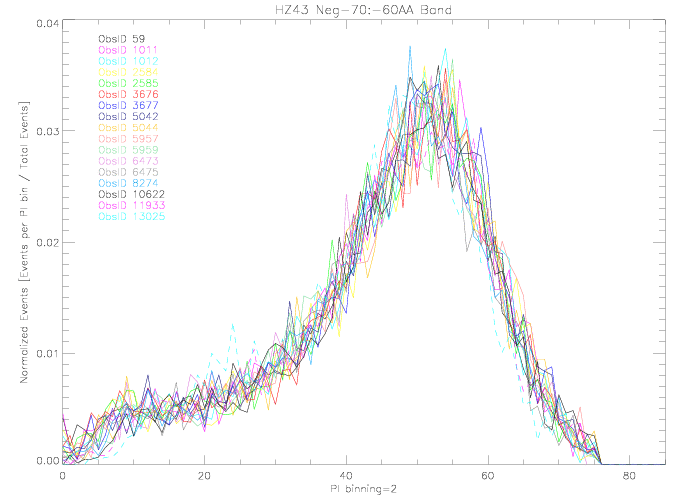
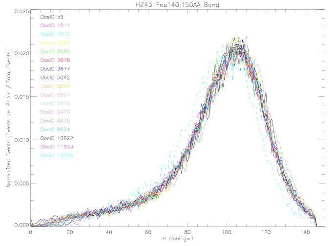
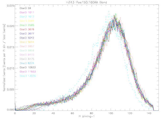
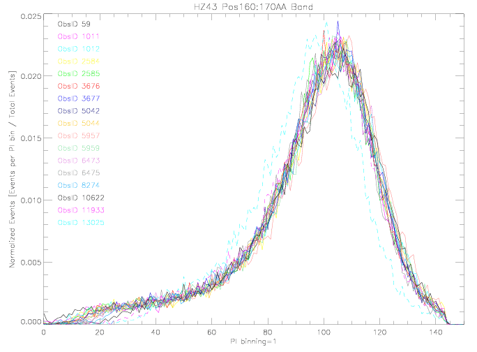
Fig. 5 shows PI PHDs over time for a few wavelength ranges that show clear excess QE losses (λ = +140 to +150, +150 to +160, and +160 to +170 Å) or possible excesses (λ = -60 to -70, -70 to -80, and -80 to -90 Å). The wavelength range -150 to -160 Å has not displayed excess QE loss and was chosen for comparison. The PHDs for ObsID 13025 are systematically low for unknown reasons; those for ObsID 5957 are somewhat higher than average, as noted during the 2008 gain map recalibration. As can be seen, most of the wavelength ranges shown appear to be losing an increasing fraction of their lowest-channel events as time goes on.
| ||
| -150:-160 Å (pdf) | ||
| 
| 
|
| -80:-90 Å (pdf) | -70:-80 Å (pdf) | -60:-70 Å (pdf) |
| 
| 
|
| 140:150 Å (pdf) | 150:160 Å (pdf) | 160:170 Å (pdf) |
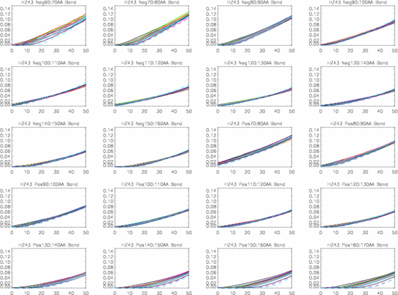
Figure 6 shows integrated count fractions (normalized to total BG-subtracted counts) versus PI. The spread between curves is a measure of whether and how fast the HRC-S gain decrease is leading to low-amplitude event losses. Note that the widest spreads are seen in detector regions with the lowest gains (see Fig. 2), e.g., λ>130 Å. Although statistics are too poor to show significant excess QE loss around -70 Å in Figs. 3 and 4, these plots indicate that it is probably occuring there, too. Another advantage is that trends in event loss can be seen even when relative QE is ~impossible to measure directly because of source variability (such as for PKS 2155); the region around -30 Å needs to be looked at, since gain is low there. (I think that if we rescale these curves to the number of counts in the PI range where event loss should be negligible--say, PI above 50 or 60--then we can obtain a pretty good estimate of the QE loss as f(t,λ). The equation for the normalized number of counts in a given PI bin in ObsID "obs" would be Nobsnorm(PI) =Nobs(PI)*{Nobs59(PI>60)/Nobs59(all PI)}/Nobs(PI>60).
|
Lately we've been making HZ43 observations once a year around March. If we need to observe more frequently that might be a little tricky.